Every year this is one of my favorite events to attend: It’s CANstruction New York hosted by @ArtsBrookfield and benefiting City Harvest food bank. In this event, various engineering, architectural and other organizations create sculptures made out of cans of food (thus CANstruction). After a period of display to the public, these food items are then donated to City Harvest. Attendees are also encouraged to bring canned and other non-perishable food items for City Harvest. It’s a good cause and the sculptures are frequently amazingly creative, display impressive engineering, and are just plain artistic.
There were 27 sculptures total. A couple of them appeared to have suffered something of a disaster (that is had fallen down). Below the cut I have 11 of my favorites (in addition to awards that I made up that I’d give them if I were the one handing out awards, lol)
There were 27 sculptures total. A couple of them appeared to have suffered something of a disaster (that is had fallen down). Below the cut I have 11 of my favorites (in addition to awards that I made up that I’d give them if I were the one handing out awards, lol)
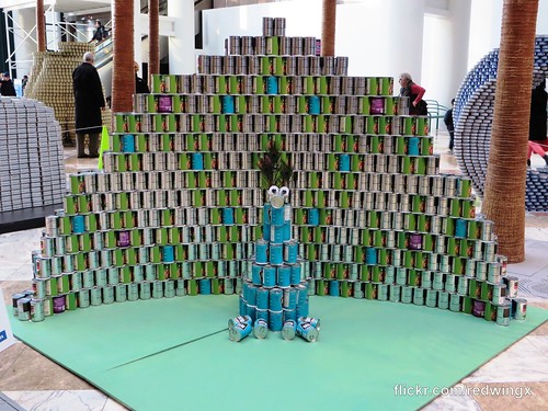
Name: Put Hunger Behind Us
By: Thonton Tomasetti
Cans: 1756 cans that will feed 1393 New Yorkers
My Personal Award: Most Adorable
Who knew a bunch of cans of beans and peas could be so adorable. But look at this peacock! I loved how the bottom cans picked up the hue of the mat they were on and loved how they spelled out "Put Hunger Behind Us" with cans on the back.
Front (adorable!)
Back
- - - - - - - - - -
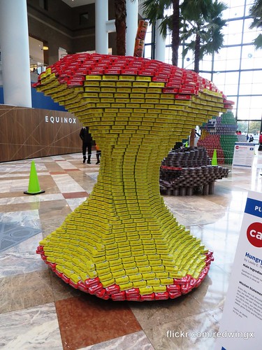
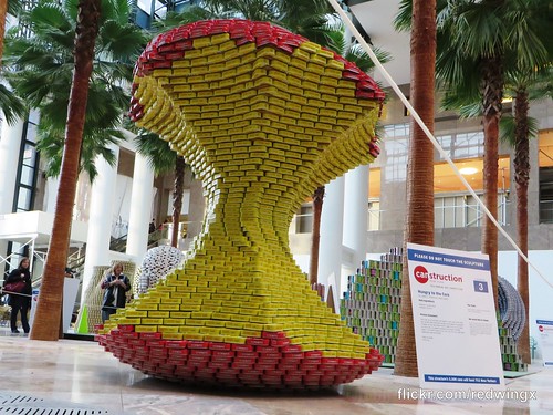
Name: Hungry to the Core
By: Leslie E. Robertson Associates
Cans: 3300 cans that will feed 752 New Yorkers
My Personal Award: Most Impressive Engineering and Best Detail
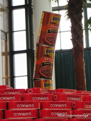
So this one was just wonderful. I have no idea how the managed to balance that entire top of the sculpture through the middle pedestal but they did and it was just a wonderful effect. And the best detail is the simple three little cans of baked beans that formed the stem. Loved it. :)
The view from below really shows just how delicately balanced this really is!
Baked Beans stem:
- - - - - - - - - -
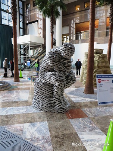
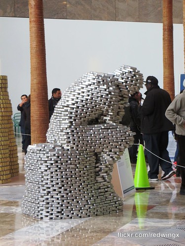
Name: The Thinker
By: CetraRuddy
Cans: 4320 cans that will feed 844 New Yorkers
My Personal Award: Overall Favorite
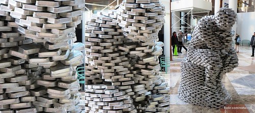
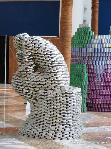
I can't believe that an all-sardine sculpture was my favorite of the year, but since The Thinker is one of my favorite sculptures in the world, that helped (I hereby challenge someone to do MichaelCANgelo's David next year... just an idea ;) ). I think I just liked how chaotic it looked and yet it all held together. The further you got from it, the more real it looked. It just kept drawing my eye. Kudos to CentraRuddy!
This sequence starts with a completely chaotic meaningless close up and pulls out to reveal the sculpture.
And then from furthest away. It’s a true Sardine!Rodin.
And it’s given how chaotically put together it is (mirroring the rough edges of the statue it pays homage to), it’s pretty impressive how it all holds together and how it balances.
- - - - - - - - - -
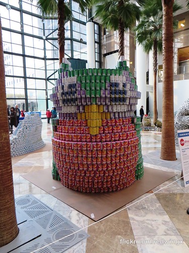
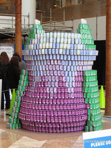
Name: Give a Hoot About Hunger
By: WSP
Cans: 5384 cans that will feed 4311 New Yorkers
My Personal Award: More than 5000 cans! and Most Variety of Color
This one was just all kinds of cute and impressive from the name to the sheer size to the variety of cans used, all coming together for a complete sculpture, front and back. It's shape said 'owl' and being able to distinguish the features through the use of different colors just added to it. And can you imagine designing this thing and placing over 5000 individual cans?! Really impressive!
How cute is this guy!?
Even the back shows detail and thought and color.
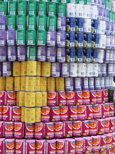
As I do every year, I marvel at the use of different labels to create different detail.
- - - - - - - - - -
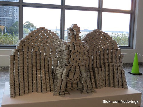
Name: Ameri'can Eagle
By: MTA-NYCT
Cans: 2100 cans that will feed 383 New Yorkers
My Personal Award: Best backdrop
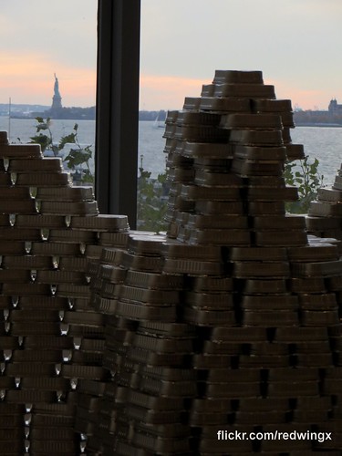
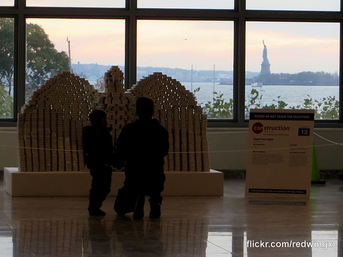
Whomever placed this sculpture knew what they were doing. I mean, the eagle sculpture was monotone but still impressive, but it was the (real) Statue of Liberty in the background that really sold this one.
The Ameri’CAN Eagle:
But seriously, look at how ridiculously dramatic New York and the sunset were being in the background.
- - - - - - - - - -
Name: Food Banksy
By: HOK
Cans: 2028 Cans that will feed 1547 New Yorkers
My Personal Award: OMG A Banksy! (and Title Honorable Mention)
I had a little love affair with Banksy's 30 day stint in NYC last year and since then have had a soft spot for all things Banksy. I would have loved to have seen this upright, but even as is, I love the idea and the homage. (also, yay for pasta! a nice break from the sardines, tuna, and beans, lol)
Admittedly, you kind of have to know what this is to fully appreciate it.
- - - - - - - - - -
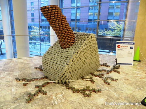
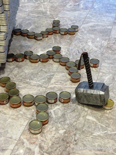
Name: Smite Hunger
By: DeSimone Consulting Engineers
Cans: 3186 Cans that will feed 1660 New Yorkers
My Personal Award: Best Name Runner-up and Best Mission Statement
Here is the mission statement on the sign:
HUNGER! I would have words with thee: For too long you have been a pestilence on this fair city, but no longer! For I, Thor, Son of Odin, shall no longer stand by as you lay waste to these fair people! By Odin’s beard, today you shall taste the fury of my hammer!
Good people, now I have words for thee: Hunger is a fearsome foe, but together we are stronger! Join with me and together we shall SMITE HUNGER!!
As for the sculpture itself, I loved how simple this seemed but how perfect it was in execution. It's a massive structure (a giant Thor hammer) and conveys that but also has a pretty delicate balancing act with that handle coming out at an angle. And can we talk about the simplicity of the simple small cans creating spidery cracks in the marble floor? Love it!
Thwack!
Spidery Cracks in the marble:
- - - - - - - - - -
Name: Hunger Free Terminal
By: National Reprographics
Cans: 1152 cans that will feed 900 New Yorkers
My Personal Award: Best New York themed runner up
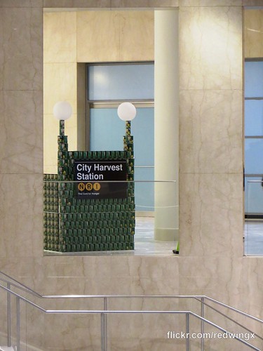
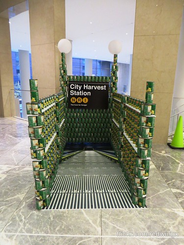
I first saw this one from across the mezzanine level and it was instantly recognizable for anyone whose primary transportation is the New York City subway. I would have loved a little creativity for the lights and maybe some sidewalk around it, but other than that I loved this "entrance way to ending hunger" as they described it.
My first view from across the mezzanine, love at first sight…
I do love the optical illusion of the escalator going down into the station:
- - - - - - - - - -
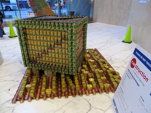
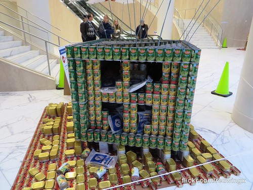
Name: Put the Drop on Hunger
By: Cerami & Associates
Cans: 2364 Cans that will feed 1316 New Yorkers
My Personal Award: The More I saw of It, the More I Liked It
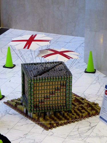
At first I really didn't get it. I thought it supposed to be the Up House, or then some restaurant with umbrellas, but then I realized it was a food supply drop. And I went, "Oh...cool!". Then I realized that it was dropped on sardine cans that formed the words 'Hunger' so it was really dropping food on hunger. And I went, "Oh, really cool!". And THEN I went to the back of it and this box was not hollow or just sold cans, it was full of food supplies -- read to eat meals, rice, pallets of cans of food and I was sold. Really liked this one for that creativity.
As seen from above:
Sardine cans spelling out ‘Hunger’ upon which the food drop lands:
The back showing this box is packed with food to end hunger:
- - - - - - - - - -
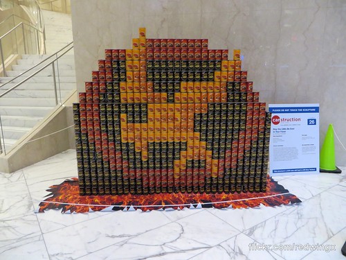
By: Weidlinger Associates
Cans: 1920 Cans that will feed 1438 New Yorkers
My Personal Award: Best Use of Colorful Cans
I will be honest, I am not a fan of The Hunger Games. Though, I do admit that with that kind of title, it seems a natural for this event. And, despite my general dislike, this particular sculpture was far and away the most vivid. It had the most deep / striking colors. It really did pop and stood out from all other sculptures in that respect, and I really did enjoy it for that.
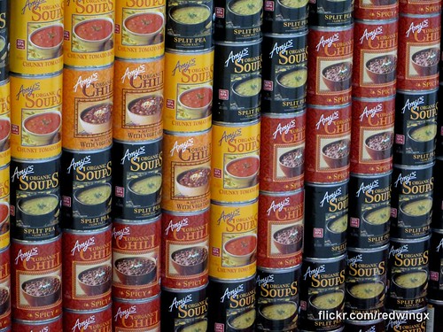
Apparently Amy’s Chili is the go-to for colorful cans! :)
- - - - - - - - - -
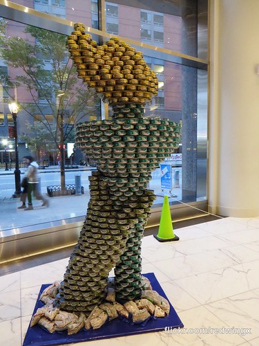
Name: StaTUNA of Liberty
By: Gilsanz Murray Steficek LLP
Cans: 1848 Cans that will feed 481 New Yorkers
My Personal Award: Best Title & Best New-York Themed
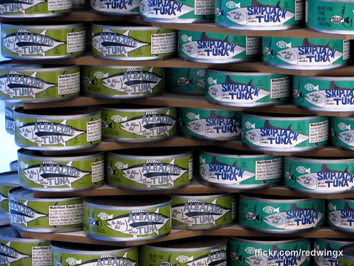
Anything that's iconic New York is going to speak t me and this certainly does. I loved the elegance of it (especially the flame) and the nuance of the two every so slightly different can colors of the hand and the torch so the observer can more easily tell the two apart. And, the balancing act of this one is no small feat (again, particularly with the flame). From afar, it really was hard to tell it was really just a bunch of tuna fish!
That’s the prettiest tuna fish ever.
Two tone green.
Until next year!


No comments:
Post a Comment